Julia Lam
UX Designer

Ascend
Designing a digital space for training, community, and growth
Ascend is an app that promotes consistency, social interaction, and goal-setting. It ties together the best parts of climbing in a gym and brings it right to the screen, while simultaneously allowing for more ease and comfortability when tracking training or learning how to exercise more efficiently and healthily.
Context:
Beta - The intended way to do a climb
Send - To finish a climb by touching both hands to the designated "top" hold
Scope: Solo Project, Summer 2024
My Role: UX Designer and Researcher
Duration: 3 months
Tools: Figma, Procreate
Skills: Competitive analysis, journey mapping, information architecture, UI design
The Problem
Clearly, climbers love climbing, but training with non-climbing exercises often feels tedious and overwhelming. Many people want to start training but don’t know where to begin, facing barriers like lack of knowledge, motivation, and accountability.
The Goal
To design a simple, streamlined, and intuitive app for climbers to track progress, reflect, and plan training while encouraging community support. Create a system that makes it easy for beginners to start with zero prior knowledge, and provides accessible learning resources. At the same time it offers deep customization for experienced climbers to tailor programs to their goals.
💭 Uncovering Insights
Research Methods
The needs of the users always come first, so to better understand the issues outlined in the problem statement, I conducted user research.
-
Survey - I gathered perspectives from climbers about climbing, training, and social media to establish a broad foundation of insights.
-
Competitive Analysis - I evaluated existing apps to ensure Ascend offers unique value and experiences not found elsewhere.
-
User Journey Map - I mapped out climbers' key needs, wants, and pain points
-
User interviews - I conducted user interviews to validate previous findings.
Survey Findings
I sent out a survey to nine climbers, asking them a mix of multiple-choice questions to collect quantitative data and open-ended questions to gather qualitative insights. This approach allowed me to capture both measurable trends and personal perspectives to better understand their experiences with climbing and training.

75% of users want to start a training regimen.

62.5% of users would benefit from a rewards system to stay encouraged and motivated for training.

87.5% of users are motivated by encouragement from other climbers.
"...places to share beta, introduce ourselves, and make connection[s]..." - climber, climbs 3-4 times a week
"...incentive for user engagement, ability to look at climbing progress over time." - climber, for 1 and a half years
"A combination of a more climbing based app... and the social aspect of being able to post videos" - climber, for 6 months
The survey responses revealed surprising insights that shaped the direction of the app. Climbers were not just looking for training tools, they wanted connection. A strong desire for video sharing and a social feed emerged, showing that community and conversation were just as important as exercise and progress tracking. This feedback shifted the design toward capturing the full climbing experience, blending training with social interaction and validation.
💡
When prompted about what they would want in an app, climbers not only focused on training, but on social connection and communication with other climbers.
Competitive Analysis
When selecting apps for competitive analysis, I drew directly from the data gathered during user research. Cling emerged as the closest comparison to what Ascend could become, while Instagram and Griptonite stood out as the primary climbing apps users currently rely on.
Cling
No follow feature; limited flexibility and customization; only one project allowed; unintuitive interface
Not climbing-specific; difficult to find beta videos; social network focus, but limited training features
Griptonite
Impersonal due to low community engagement; fails to retain user interest; limited promotion of interaction between users
Discovering the User Journey
The user journey map helped me deepen empathy for potential users and pinpoint key pain points. I found that many climbers lose motivation after training for a while. They want to stay consistent but lack external motivators, as progress often isn’t immediately visible. This insight highlighted the need for Ascend to provide visual indicators of success and make the training process engaging. Additionally, veteran climbers have different needs than novices, which informed the app’s customizable approach.

User Journey Map, visualizing key user needs, pain points, and behaviors across the training experience
💡
Visual indicators of success and some level of customization is needed to make the app useful and appealing to all climbers.
✏️ Continuous Ideation
To The Drawing Board
Keeping in mind what I learned from the research process, I ideated through many different iterations of what the app could look like. I wanted the app to be simple, streamlined, and efficient to use.
💡
The app should be simple with minimal menus to navigate through and as few inputs as possible in order to not detract from a climbing session due to a consistent need to stare at the phone screen.

Low Fidelity Wireframes
After sketching out many low fidelity wireframes, I came to the conclusion that unlike most of the other competitive apps, Ascend shouldn't open to a social media feed. Instead, it should open to a home page that showcases a visual representation of progress, in order to keep users on track with their goals and motivated to continue training, which is more in line with the app's purpose.
User Testing
After developing Lo-Fi mockups and prototypes, I conducted user testing to identify improvements and tailor Ascend for a seamless, intuitive experience. I used feedback to inform each design decision after each iteration. These are the key design points that emerged from testing:
-
Journal Navigation - Each entry should have an arrow to the one before or after it for easier navigation and a truer journal-like experience.
-
Challenge Visibility - The next challenge on the weekly challenges page should be showcased on the home page to encourage engagement.
-
Social Feed Design - Posts should be flat, not cards, for a more seamless design.
-
Peer Validation - When a user completes a weekly challenge, it should be posted on the social media feed to provide recognition from friends.
-
Color Palette - Use bright colors to encourage energetic training, with cooler contrasting tones to maintain a professional, modern look.
-
Background Design - Use a white background instead of tan to make the app feel more professional and less dated.
Design Iterations

🎨 Final designs & prototyping
High-Fidelity Designs


JOURNAL
Easily access a journal that stores all information by date, and as per user request, flip through as though it's an actual book so you can track your progress and see improvement.
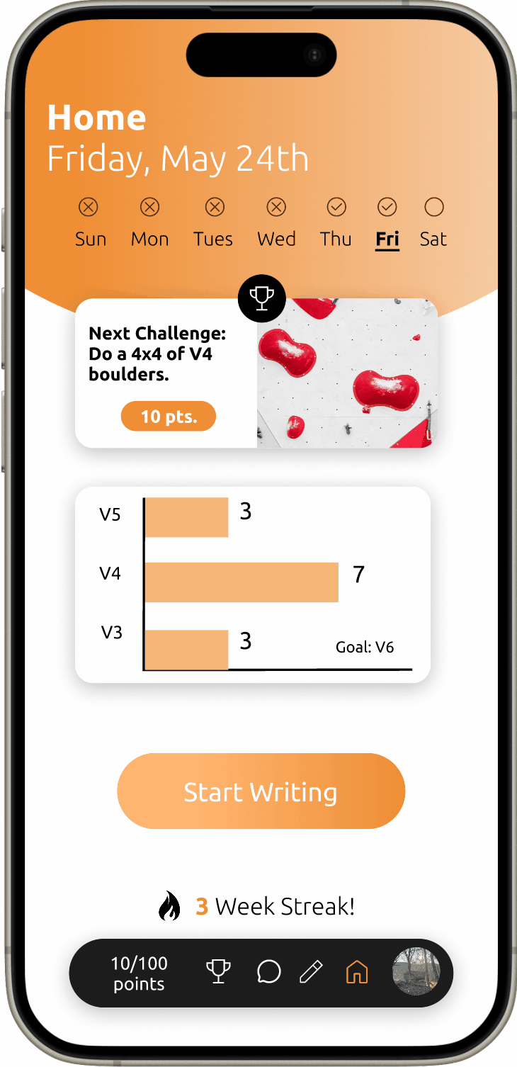
WEEKLY CHALLENGES
View a recommended weekly challenge from the home screen, and mark them off as the week progresses for an easy visual tracker of accomplishments. Add in your own challenges to tailor your climbing sessions to your specific needs.
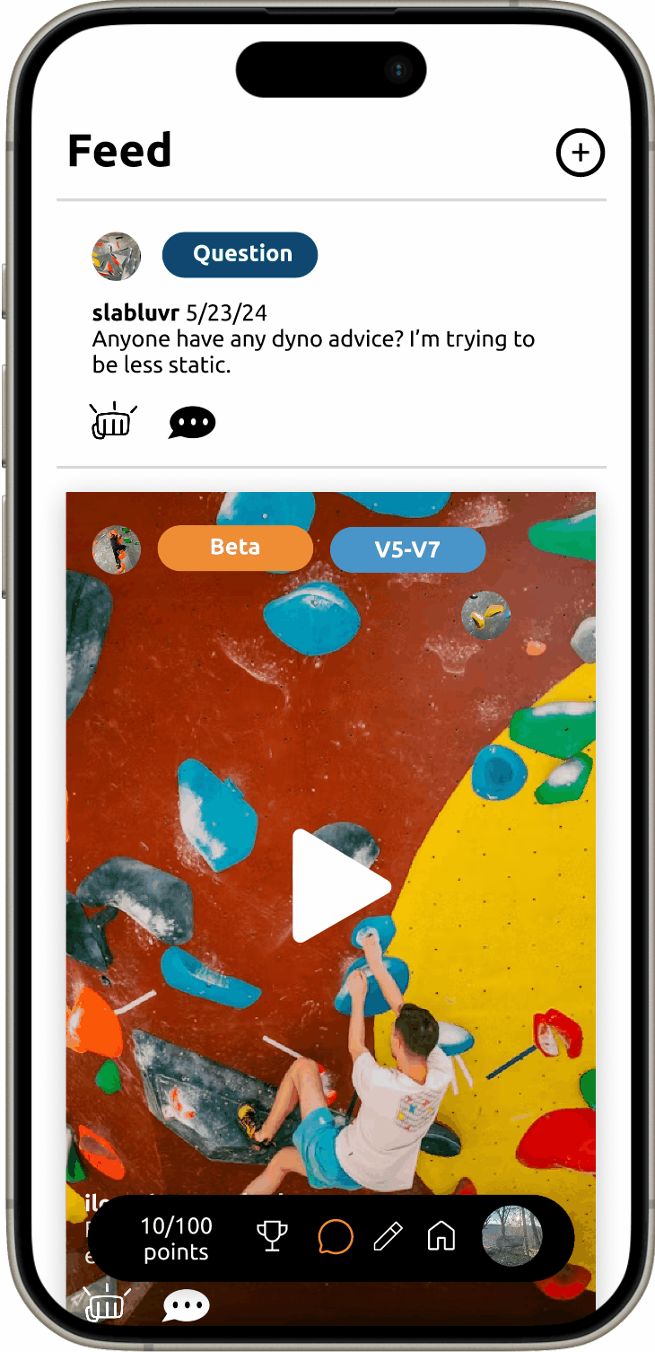
CLIMBING CHATS
With a clean and easily readable social media feed, it's easy for new climbers to ask questions and veteran climbers to answer them. Find beta easily with the help of tags, and praise and congratulate your friends when you see a post that their climbing challenges for the week have been completed.
🤔 Reflection
Takeaways
Ascend is an app made by climbers, for climbers. I found myself in the unique situation of being able to easily empathize with the users of this app because I could very clearly see myself being a user. However, this caused me to have to focus on one of my personal most important design tenets: what you want may not be what everyone wants. I made an effort to not let what I wanted cloud my design vision, and made sure to focus on designing based on the feedback that I received from user research and user testing.
As it stands, Ascend achieves the goal that I set out to accomplish: create an app that has the capabilities to bring the entire experience of climbing: the training, climbing, and chatting, to the screen.