Julia Lam
UX Designer

Discord Deep Dive
From user insights to design solutions: rethinking Discord’s experience
Millions of people use Discord, a server-based community chatting app, including myself. As a product, it's very beloved, but it's not without its problems. I overheard some friends complaining about unintuitive design and "unnecessary updates," and it inspired me to conduct some UX Research in order to better understand where Discord is flawed, and what could possibly be changed to improve the user experience.
Scope: IBM Accelerate 2024 Design Track Final Project
My Role: UX Researcher
Duration: 1 Week
Tools: Figma, Miro, Procreate
Research Methods:
Survey, User Interviews, Affinity Mapping, Personas, A/B Testing
Project Context
About Discord
Discord is a social platform that allows users to create servers with voice and text channels in order to communicate with their friends and communities. It is used by over a hundred million people, making it one of the most popular online communication services available. Discord is offered as both a web application and a mobile app. There is also a premium version of Discord with two tiers - Discord Nitro and Discord Nitro Basic.
150 million monthly active users. 19 million active servers per week. 4 billion server conversation minutes daily.
The Problem
Discord’s rapid growth and frequent updates introduced usability gaps, unintuitive navigation, and confusing design choices that made it difficult for users to communicate and manage servers effectively. The experience lacked consistency and clarity, leading to frustration and inefficiency in core workflows such as navigating channels, managing notifications, and keeping up with updates.
The Goal
To conduct UX Research to determine the main pain points of Discord users, and come up with alternative design choices and solutions in order to address and alleviate those pain points.
💭 Collecting the data
Process Outline
I began with broad research methods to quickly gather a large set of general data. From there, I narrowed my focus by talking directly with users to uncover specific pain points. Finally, I widened my scope again, applying those insights back to the broader user base to strike a balance that addressed the needs of the majority.
Priority Matrix: Mapping issues by impact and feasibility

General Research
I first took to the internet to determine what users from around the globe were saying about Discord. After perusing through the App Store reviews, I identified the most common complaints:
-
Lack of options for premium tiers
-
Confusing UI
-
Unintuitive navigation
-
Steep learning curve
-
App freezes/glitches
Survey Findings
I then sent out a survey to Discord users to gather quantitative data that could validate the insights from my initial qualitative research. The survey helped confirm key pain points and identify the most critical issues to explore further in the research process. A total of 12 participants responded, providing valuable data to guide the next phase of the study.


81.8% of users have struggled due to file size limitations
63.6% of users have experienced a glitch or bug when using Discord

90.9% of users would not buy Discord Nitro
User Interviews
I then sat down with avid users of Discord in order to better narrow down what a target-audience user might have issues with. I took the results from the surveys and my general research to inform my questions, and formed open-ended questions that allowed the interviewees to speak their minds freely and give their feedback openly.
7 Year User
“The app- I don’t like it anymore. Also the swiping right makes you respond instead of seeing who’s in the chat or who’s online. I haven’t gotten used to it, it’s unintuitive.”
8 Year User
“You have to pay money for that service even though it’s useful, and you can stream high quality videos but I can’t because of Nitro.”
6 Year User
"“On the mobile app, if you choose to watch someone stream that is essentially the only thing you can do. Typing is difficult. Keeping the stream popped out is impossible. On the desktop side, it’s much much better."
💡
A key insight from user interviews was that most pain points were specific to Discord’s mobile app.
The user interviews allowed me to gather a good amount of qualitative data, and paired with the results of the survey and general research, this is when I uncovered something intriguing- there were a surprising amount of complaints that are Discord Mobile specific. However, with the amount of qualitative information that I gained from the interviews, I knew I had to categorize and condense it into a more manageable format before I started drawing any concrete conclusions.
🧠 Time for analysis
Affinity Mapping
In order to better analyze the information that I had gathered, I wrote down all of the feedback I had gotten on sticky notes in Miro, and created an affinity map with groupings based on the different categories and patterns of issues that I identified. This affinity map validated what I had begun to suspect after the interview phase - there were a surprising amount of stickies just for the mobile application version of Discord.

Affinity Map, grouping related user issues to reveal patterns and key pain points.
User Persona
Armed with the knowledge of the most common user issues and a better understanding of the target audience as a whole, I developed a User Persona in order to solidify my understanding and create a reference to circle back to in order to maintain empathy for the users.

User Persona, synthesizing research findings to represent key user needs and behaviors
The creation of this persona helped me develop another key insight: the majority of Discord users are high school and college students. There are many complaints about stream quality and audio quality, complaints that could be fixed with the purchase of Nitro - but as students, most of the current users don't have the disposable income to justify buying it.
💡
College and high school students can't afford to fix their problems by buying Discord Nitro.
🎉 Putting it all together
Research Synthesis
After examining and processing all of my data, this is what I discovered:
-
Most of the issues that users have are on the mobile app only.
-
Desktop and mobile aren’t similar. The mental map of the app and website should line up in order to form a seamless and congruent experience when utilizing the service on different platforms.
-
On desktop, it’s servers on the left, chat in the middle, members on the right. But on mobile, swiping to the left to access the right brings up a reply box, not the people in the server. Very unintuitive, and a lot of users dislike it. (See graphics below).
-
-
People are frustrated with stream and audio quality which can be fixed by purchasing Discord Nitro- but people do not want to pay. This leads to an awkward middle ground where users are frustrated, but not frustrated enough to pay to solve the problem.
-
Creating servers and adding bots is confusing for people with a lack of technical experience.
Discord Web Application
.png)
Discord Mobile App
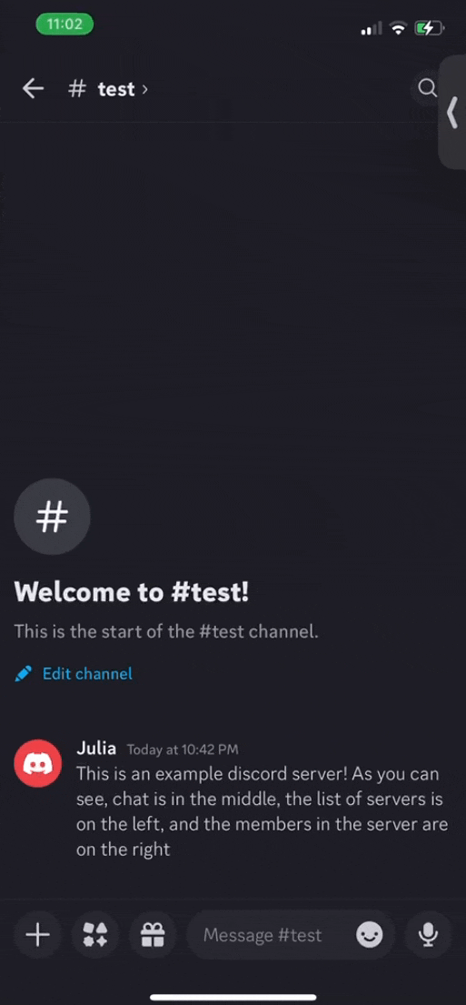
The two different platforms promote a different interactive experience. Users are likely to use both the mobile and desktop version of Discord. The desktop version of Discord has a very clear and intuitive layout that the users are used to - which makes it more confusing when the experience does not line up on the mobile app in terms of swipe gestures. In particular, swiping to access the right does not bring up the member's list, it brings up a reply feature. In order to access the member's list, you instead have to click on the name of the channel.
💡
Desktop and mobile Discord use different interaction patterns, causing confusion, especially with the swipe gesture.
Based on the insights that I uncovered through the research process, I came up with some design changes that could potentially enhance the user experience of Discord.
Design Ideas
-
Make the desktop and mobile versions of Discord more congruent
-
Eliminate the swipe feature for replies, and instead roll it back to the original interaction which was swipe to view members list.
-
-
Create a better tutorial
-
Improve the existing tutorial and tips notifications for a more in-depth and interactive “onboarding” process when first opening the app and when first creating a server.
-
-
Improve in-stream UI
-
Make it easier for Discord Mobile users to interact with other features of the app while watching a stream. It’s more consistent with the goal of Discord - the app already provides chat services as well as game services to use while watching a stream.
-
-
Change Discord Nitro
-
Create different tiers of Discord Nitro to allow people to be more selective with what premium features they want to purchase, increasing likelihood that the users will purchase Nitro.
-
-
Support Tickets
-
Make it easier for users to report bugs or glitches that they encounter.
-
A/B Testing
In order to validate the design ideas that I developed, I conducted A/B concept testing using some Lo-Fi wireframes in order to gauge user interest in the proposed changes. I decided to tackle the design decision of adding the Friends List tab into the home bar on the Discord mobile app, instead of putting it into the profile tab. This is because I feel that it encapsulates a lot of the issues I identified that users had with Discord - unintuitive mobile UI, too much tabbing through menus in order to find features, and unnecessary updates that didn't actually improve quality of life (the friends tab used to be in the home bar until a fairly recent UI update).
Concept A: The current Discord UI, with the friends list button featured in the profile screen.
Concept B: An updated version of the Discord UI, where the friends list button is included in the home bar.
💡

The users that I conducted the testing with all selected option B as their preferred UI, commenting that it was more convenient and intuitive.
🖌️ Creation space
High-Fidelity Redesign
Using feedback from users, I redesigned Discord mobile screens to incorporate some of the key improvements I came up with, including restoring the swipe gesture to access server members and moving the Friends List back to the home bar. The screens are organized to align more closely with the desktop version, creating a consistent and intuitive experience across platforms.


Redesigned Discord Screens based on UXR findings. Friends button back in the home bar, and swipe to view members feature restored.
🤔 Reflection
Takeaways
What I gained from this process was a reinforcement of something that I am constantly trying to internalize: Everything is a prototype. Discord is a service that is used and loved by millions, including myself, but the developers and designers are constantly iterating and trying new things. Sometimes those updates don't resonate with the user base, and UX Research can help to identify those problems and pain points in order to set the stage for a new round of iteration and design. Products are constantly evolving, especially software, and I once again reinforced to myself through this project how important it is to understand your user's wants and needs.
If I had more time, I would have liked to reach out to a more varied selection of users for interviews. I would have liked to hear the opinions of new Discord users, or those who only use Discord for school or work. However, given the time constraints, I'm satisfied with what I accomplished and learned. Moving forward, I hope to utilize the UX Research methods that I learned here in further projects!